
Biokhaan needed custom packaging for the products that they do sell, they already have a vibrant brand, we focused on it and made a custom style that fits the brand minimalist and vibrant feel. Biokhaan's employers needed a business card, brochures and flyers for their messaging so they would be able to communicate with there typical clients. to be able to showcase their products, it was necessary to create mockups for each product type so that it can be used on social medias and their website.
SERVICES


In order to help the user to get to know the brand, we needed consistency, from the first calls, we were always looking to do a system that can be scalable to do for upcoming products.
The system relate on the packaging to have the main color of the brand, which is orange, as a base for all food supplement products, and add a differentiation color to each product to make it easy to differentiate between the range of products.
The differentiation color depends mostly on the ingredients of that specific product.


The Cosmetic
logo
Biokhaan’s product are Organic premium products, and they felt that there current branding and website is not showcasing that.
The first step of the project was to redo the branding and create a visual system for them to build on as well as packaging design of all of the products.

Cosmetic
Colors
In terms of color, since the orange was already used for the food supplment, we need to find a solution to differentiate the cosmetic from it.
Appart from a different layout on the packaging, we came up with a color system for each sub category

Packaging
process
To make it scalable enough, we combined each main subcategory color with a product specific color to help the user not confusing the products and be sure that the combination of colors we’re using won’t be repeated neither now or in the future

In order to help the user to get to know the brand, we needed consistency, from the first calls, we were always looking to do a system that can be scalable to do for upcoming products.
The system relate on the packaging to have the main color of the brand, which is orange, as a base for all food supplement products, and add a differentiation color to each product to make it easy to differentiate between the range of products.
The differentiation color depends mostly on the ingredients of that specific product.


The
cOLLATERALS


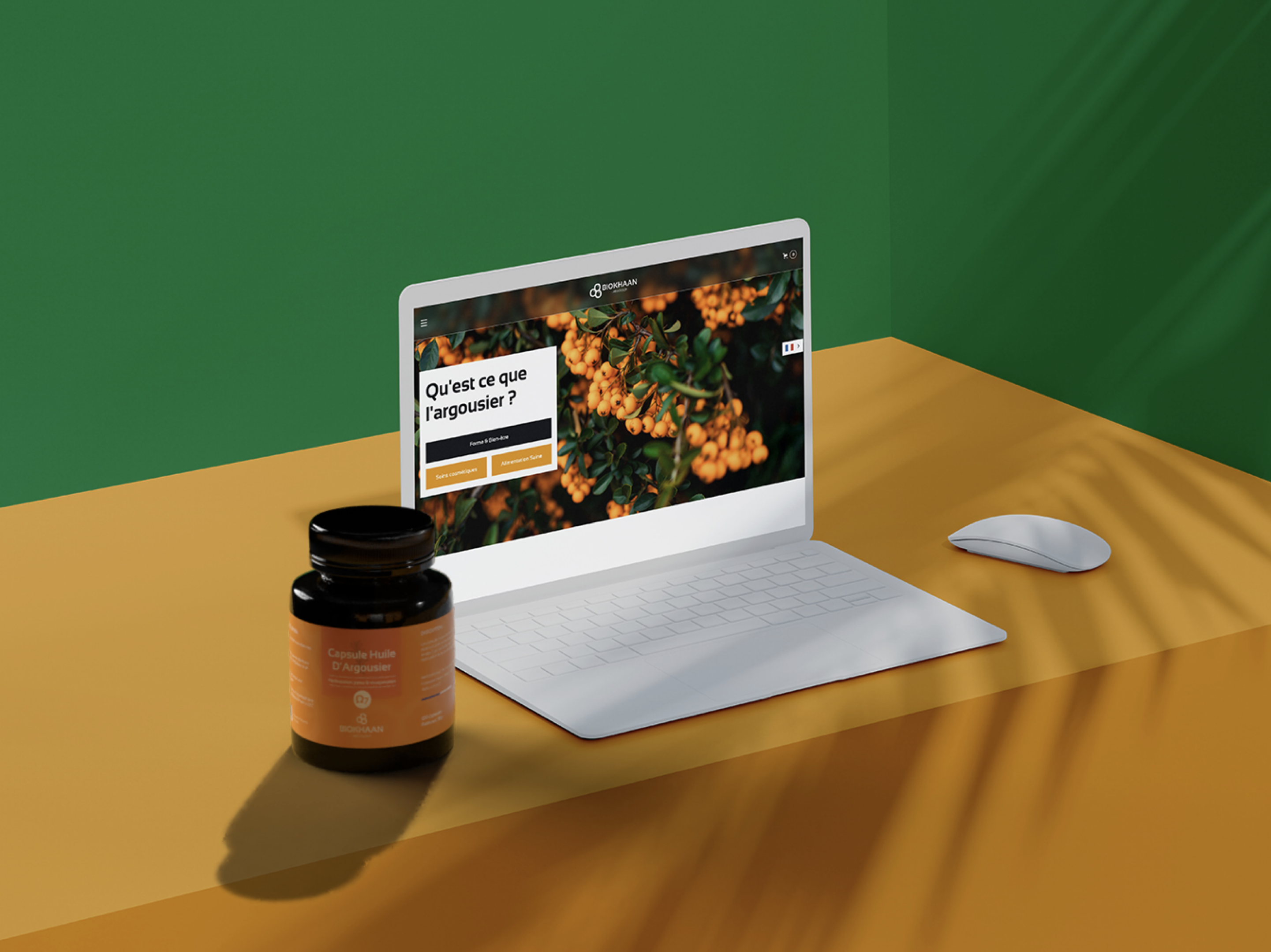
The Website
process
Wireframe
Focus on the UX of the site and the overall structure and how we can navigate the site
Mockup
Focus on the UI of the site, taking the wireframe and adding all the elements of the visual identity, colors, font, mockups, packages …
Development
Development of the mockup we worked on, adding animations and making sure that the site is responsive


Want to see more work ?